Energy Data Visualization Requires Additional Approaches to Continue to be Relevant in a World with Greater Low-Carbon Generation
 I. A. Grant Wilson
- Environmental and Energy Engineering Group, Department of Chemical and Biological Engineering, The University of Sheffield, Sheffield, UK
The hypothesis described in this article proposes that energy visualization diagrams commonly used need additional changes to continue to be relevant in a world with greater low-carbon generation. The diagrams that display national energy data are influenced by the properties of the type of energy being displayed, which in most cases has historically meant fossil fuels, nuclear fuels, or hydro. As many energy systems throughout the world increase their use of electricity from wind- or solar-based renewables, a more granular display of energy data in the time domain is required. This article also introduces the shared axes energy diagram that provides a simple and powerful way to compare the scale and seasonality of the demands and supplies of an energy system. This aims to complement, rather than replace existing diagrams, and has an additional benefit of promoting a whole systems approach to energy systems, as differing energy vectors, such as natural gas, transport fuels, and electricity, can all be displayed together. This, in particular, is useful to both policy makers and to industry, to build a visual foundation for a whole systems narrative, which provides a basis for discussion of the synergies and opportunities across and between different energy vectors and demands. The diagram’s ability to wrap a sense of scale around a whole energy system in a simple way is thought to explain its growing popularity.
Introduction
The need to reduce the amount of greenhouse gas emissions entering the atmosphere from human activity is well understood and exemplified by the UN Framework Convention on Climate Change to hold “the increase in the global average temperature to well below 2°C and to pursue efforts to limit the temperature increase to 1.5°C” through the Paris Agreement (UNFCCC, 2015). To achieve this, many policy makers around the world will continue to focus on limiting the greenhouse gas emissions from their energy systems, with electrical systems, in particular, being an area of initial effort. The recent increases in global deployment of wind and solar electrical generation demonstrate this, with their output increasing significantly over the time period from 2006 to 2014 (136747–910923 GWh) (IRENA, 2016). This increase in deployment has provided cost reductions through economies of scale and deployment experience (Rubin et al., 2015), and these technologies are now considered mainstream choices for electrical generation alongside conventional forms of thermal generation or hydro. Having the ability to harvest the primary energy resource of wind or solar within a national or energy system boundary has an appeal not only from a low-carbon perspective but also from an energy-import dependence perspective. The main driver, so far, has been to control carbon emissions, rather than offset energy imports, but, over time, this may change, especially if the cost of imported fuels achieves greater political importance.
Having a greater level of policy support from the end user, customer base of an electrical system is a desirable outcome for policy makers charged with effecting system wide changes. This support can be influenced by end users having access to empirical evidence provided by trusted energy systems professionals. In Great Britain, a thorough resource for energy data is provided by teams at the Department of Energy and Climate Change (merged into the Department for Business, Energy, and Industrial Strategy in July 2016), the energy team at the Scottish Government, and the statistical team at BP, to name a few. These teams provide sources of energy data and utilize diagrams to convey information, with timeframes generally of a month, a quarter, or a year. The bar charts, pie charts, and line graphs in common use today were all invented by the Scotsman William Playfair around 1800 (Friendly, 2008), just over 200 years ago, and have clearly stood the test of time. These are the graphs most utilized in national level energy data visualizations. However, as increasing levels of primary energy in Great Britain is derived from wind and solar resources, wider stakeholders are becoming increasingly interested in energy data over shorter time periods, such as the energy changes between days, precisely because the nature of weather-dependent primary energy resources results in an intermittent resource.
This article proposes a hypothesis that energy visualization diagrams commonly used, need additional changes to continue to be relevant, and then describes a novel energy diagram that has been growing in importance in Great Britain. The history, methods, and considerations when creating this shared axes energy diagram (SAED) are explained, in order to allow others to create their own.
The contribution of this article is to present the hypothesis of why energy diagrams need to change, and, then, to provide a description on the creation of a SAED. The importance of the graphical representation of statistical data has not diminished since William Playfair stated in The Statistical Breviary in 1801, that “making an appeal to the eye when proportion and magnitude are concerned, is the best and readiest method of conveying a distinct idea” (Spence, 2005). This is especially true of energy data and, arguably, will increase in importance as the energy systems themselves undergo profound changes over the timeframe to 2050.
Background
Accommodating the increasing amounts of wind and solar electrical generation onto electrical grids that have historically been designed to accommodate a limited number of larger and controllable power stations has a number of challenges. One of the greatest is how to accommodate the variability inherent in weather-dependent primary energy. Wind and solar resources are unlikely to match the electrical demand for large parts of the year, and, therefore, generation from these sources has to be augmented from other sources, when there is too little (Wilson, 2016), or, indeed, local demand increased through storage or demand side management, if there is a local surplus. Electrical generation, including wind and solar, can also be curtailed in order to limit the amount of electrical energy being generated onto parts of an electrical network that is unable to accommodate or export the surplus for certain periods. This is to keep the voltage on the network within defined limits and protect equipment connected to the network and the network itself. When the source of the primary energy is a fuel or from a hydro resource, the primary energy is able to be stockpiled before it is transformed into electricity. This allows a significant buffer against supply chain disruptions, and usually allows significant load following capability (dependent on the type of power stations).
Electricity for all its marvelous benefits, is prohibitively expensive to store at scale, and it is, therefore, ordinarily changed into another form of energy, for ease and cost of storage, e.g., hydro-pumped storage (Deane et al., 2010; Wilson et al., 2010; Hittinger et al., 2012; Castillo and Gayme, 2014; Hittinger and Lueken, 2015) or power-to-gas (Schiebahn et al., 2015; Götz et al., 2016) and, then, changed back to electricity at a later stage, if required. From a whole systems perspective, primary electricity can be transformed into another form of energy and be utilized in the energy system without the need to be transformed back into electricity, which may offer multiple benefits.
To reiterate, an important difference between historical fuel/hydro-based electrical systems and future primary electricity-based systems is in the ability to load follow, i.e., to control the output of power plants (thermal or hydro) to match the electrical demand. This controllability of electrical output from certain power plants is itself based on accessing the underlying fuel or hydro resource (no fuel = no electricity), as the energy is stored in the fuels or water resources themselves. Therefore, if a nation wished to have a greater security of supply through greater levels of “stored” electrical energy, it could simply mandate greater levels of fuel stockpiles to be readily available to electrical generators. Natural gas and coal are internationally traded commodities, and a country, such as Great Britain, with sufficient import capacity for either should not expect to run out of these fossil fuels over the medium term. The fuels should continue to be available for importation, as and when required. However, natural gas supplies can become tight, as the level of gas in storage is difficult to forecast from year to year. The major use of natural gas in Great Britain is for domestic heating, where the demand is intrinsically linked to the weather patterns over the winter period. These weather patterns are highly complex and difficult to forecast for a season in advance (Slingo et al., 2014; Bauer et al., 2015).
Electrical generation based on the wind or the sun has a different level of control that generators and system operators can call upon. Wind or solar generation can be curtailed (their outputs can be turned down) or, perhaps, their outputs can be turned up if they were originally part loaded. All generation types share a similarity that they cannot produce electricity if their energy inputs are unavailable and is true of fuel-based generation as it is of wind- or solar-based generation. The crucial difference is that, unlike fuels, the wind or the sun cannot be stored prior to conversion to electricity or indeed purchased and imported from other countries. This lack of control over the input to wind or solar generation and, therefore, the output from wind or solar generation to match electrical demand, is the basis of a major concern for policy makers and wider publics.
Hypothesis
The hypothesis proposes that energy visualization diagrams commonly used need additional changes to continue to be relevant in a world with greater low-carbon generation.
Energy analysis has several diagrams that are popular due to their ability to present information in a clear and concise visual manner. The majority of energy data visualizations are bar charts, pie charts, or line graphs (BP, 2016), which typically show the changes in energy data over a year, a quarter, or even a month. These are perfectly suitable for energy systems that are based on fossil and hydro sources of primary energy, where the data being displayed show the trends over annual timeframes. Implicit in this is an assumption that these primary energy sources continue to be available over the timeframes being shown. Figure 1 (DECC, 2014) shows an shows an Energy Flow Chart (a Sankey diagram) for 2014 for the United Kingdom. This is a more complex diagram than a simple bar or line chart and is useful to see the scale of energy vectors and demands. However, these are aggregated over a year, which, therefore, masks the seasonality of primary energy supply and demands that change throughout the year. As the primary energy sources for the UK change to incorporate greater amounts of wind- and solar-derived electricity, this masking of supply and demand variation becomes more of a problem. Additional diagrams are, therefore, needed to provide insights into this changing energy system, with a level of resolution that is appropriate to the nature of the primary energy source itself.
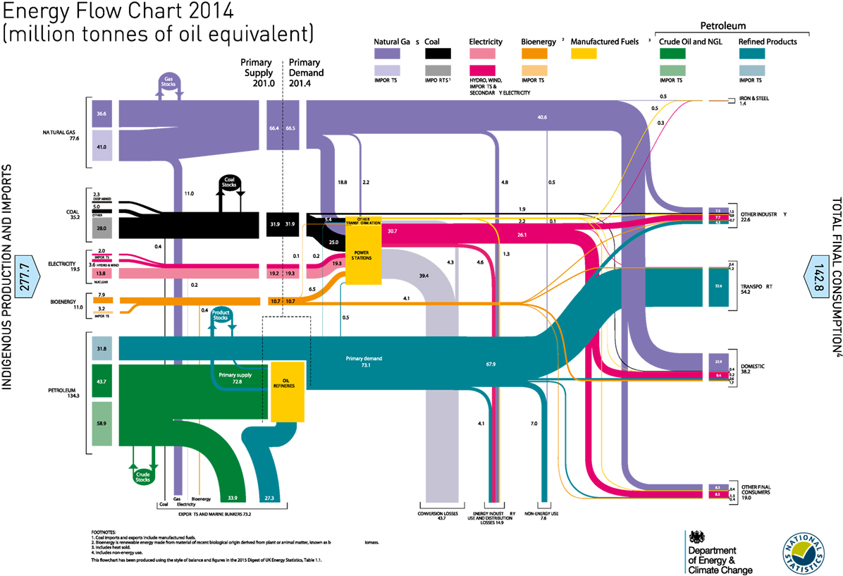
Figure 1. Sankey diagram for the United Kingdom for 2014 – values are shown aggregated over a year.
The Shared Axes Energy Diagram
A SAED was created to overcome some of the limitations with the typical bar and line charts with monthly or yearly resolutions. It aims to provide the continued relevance required of energy data visualization, by allowing a greater insight into the scale and seasonality of the generation from weather-dependent electrical generation. The diagram also provides the ability to visualize low-carbon generation against various different supplies on the same axes, which provides a sense of the scale and timing of how one relates to another.
Another major aim of the SAED is to allow insights in a whole systems approach. It seems obvious that in a northern European country such as Great Britain that the heating demand would be significantly greater than the heating demand in the summer, but it is interesting to understand how this might compare to the demand for electricity, and to transport fuels. This whole systems approach of thinking about energy systems (rather than in silos) is crucial to the transition to greater amounts of primary energy coming from weather-dependent renewable energy. The historical separation of energy market legislation along energy vector boundaries, e.g., liquid fuels, electricity, natural gas, will eventually become open to question, as energy service boundaries become blurred in the future. This whole systems approach is driven by the increase in low-carbon generation and also by technology innovation, e.g., in the transport sector, where electric vehicles will transfer an energy demand from the liquid fuels network over to the electrical network.
The diagram has been growing in popularity in recent years and is complementary to other forms of energy data visualization, as it provides additional insights into the scale and seasonality of energy supplies and demands. Much consideration was given to a number of alternative names for the diagram, such as the titles given in publications using various versions of the diagram, e.g., “Great Britain’s energy vectors daily demand” (Wilson et al., 2013a) or “UK energy vectors daily demand in TWh per day” (Wilson et al., 2013b), or “Transmission level daily GB Energy – in TWh per day” (Wilson et al., 2014). However, for the sake of simplicity, the name “shared axes energy diagram” has been chosen.
In his 2008 paper on Sankey diagrams, Schmidt states that “there have been no rules for drawing up the diagrams, except those of visual perception and intuition. Despite this, a few aspects of Sankey’s diagram have been assumed implicitly by users.” This article aims to provide a background to the SAED, so that users do not need to “implicitly assume” certain aspects if they wish to create their own.
The rationale is that future energy systems will continue to need energy data viusalizations that are relevant, especially given the profound changes that energy systems will undergo to limit the emissions of greenhouse gases. The SAED supports whole systems thinking (Strbac et al., 2016) and provides a sense of scale for policy makers and the wider public to understand the challenges that energy systems are facing (Bridge et al., 2013).
A SAED provides a method to contrast and compare the energy supplies and demands in an energy system over more relevant resolutions. This provides insights into the seasonality and volatility of supplies and demands, which is becoming more important with the increased deployment of weather-dependent electrical renewable energy generation.
History of the SAED
The first version of the SAED (Figure 2) was presented to the Scottish Hydrogen and Fuel Cell Association on energy storage on the 9th of March, 2012. It showed the non-daily metered (NDM) natural gas demand alongside the electrical demand for Great Britain (see Methods). The NDM gas demand is the aggregate natural gas demand from customers that are too small to need a daily meter, e.g., household properties, small industrial units, and small commercial units. The seasonality of NDM demand is felt to be a good proxy for household natural gas demand in Great Britain although the absolute amount would be less, due to the other non-household demands in the overall aggregate value. The values for electricity are for the entire electrical demand termed Initial Demand Outturn (INDO) and are available for each 30-min period over a day, however, the gas data are only available on a resolution of a daily basis.
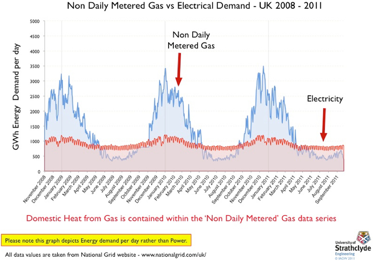
Figure 2. The initial SAED from a presentation in March 2012.
The initial diagram used a daily resolution to show the natural gas and electrical demands and how these compared to each other, to get a sense of the challenge of moving the heat demand of Great Britain over to the electrical network. In this regard, the diagram provides a simple visual comparison not only of the scale but also of the seasonal variation within and between the separate demands. Shown with a daily resolution, the seasonality of the daily gas demand becomes very obvious, which are masked by values aggregated over a year.
After this initial diagram was created, the additional demand of transport fuel was added (Figure 3). This diagram presented two major energy vectors and an energy demand in Great Britain on a daily basis for the first ever time.
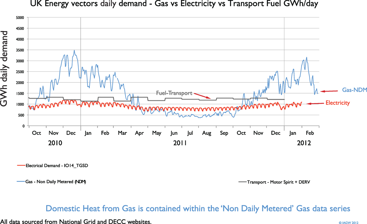
Figure 3. Initial SAED presenting the three major demands on a daily basis.
Figure 4 shows a typical SAED for Great Britain that has been published in the Scottish government’s statistical publication for energy in 2015 (Scottish Government, 2015) and 2016 (Scottish Government, 2016). It has also been used in the Institute of Mechanical Engineer’s report on energy storage (IMechE, 2014) and also their report on heat (IMechE, 2015). Feedback from several parties who have seen or have used the diagram suggests that it is a powerful tool to promote the concept of whole systems thinking and analysis. It has also been described as a useful sense check that focusses thinking on energy systems rather than just the electrical system, and in doing so, places the scale of various demands into context with each other.
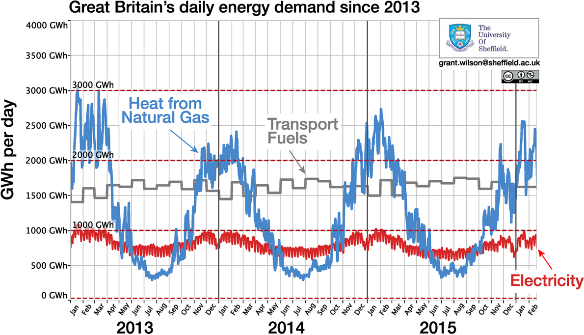
Figure 4. Typical SAED with domestic heat from natural gas, electricity, and transport fuels on a daily basis.
Methods
A SAED is a time-series plot such as Figure 4 that shows a number of primary energy supplies, energy carriers, or energy demands on the same axes and same scale for each plotted variable. It is not an energy flow diagram in the same technical manner as a Sankey diagram, as there may well be a degree of double counting or overlap between primary energy supplies, energy carriers such as electricity, and final energy demands.
The creation of a SAED depends on access to reliable underlying energy data that have sufficient detail to provide a degree of insight into the scale and variation of the variables being considered. Great Britain is fortunate in its publically available energy system data through the Transmission System operator’s website for electricity and for natural gas. The data sources for many of the diagrams in this article are:
• Natural gas data from National Grid’s data explorer (National Grid, 2016a) due to its resolution down to a single day, as well as helpful supply and demand categories.
• Transport fuel data from the energy trends spreadsheet “Deliveries of petroleum products for inland consumptions (ET 3.13)” (DECC, 2016). This is available at a resolution of 1 month.
• Electricity data from the “Metered half-hourly electricity demands” data from National Grid’s website (National Grid, 2016b).
The various data sources are recalculated into units of kilowatt hour/day in order to be comparable on a similar resolution. The natural gas and electricity data are already in kilowatt hour, but the transport fuel data was converted from the original units of 1000 ton of fuel into kilowatt hour by using energy content values of: motor spirit = 47.09 GJ/ton; derv = 45.64 GJ/ton; aviation turbine fuel = 46.19 GJ/ton. Once the data have been calculated on a daily time-series for each variable, they can then be plotted using graphing packages that users are most comfortable with.
Access to the underlying data is key to creating a SAED, and if this is not readily available within a particular energy system or country, it is recommended that the energy system stakeholders, such as the electrical system network operator, should be engaged to allow access to data for historical daily comparisons.
Major Considerations That are Typically Encountered When Creating a SAED
Common Elements
At its basic level, the SAED is a time-series plot of energy data and, therefore, has:
1. A horizontal axis in units of time
2. A vertical axis in units of energy per unit of time
The choice of units for the time-series for a daily diagram is a day. However, as the horizontal axis is a unit of time, this could be changed to present non-daily variations too, e.g., sub-daily. To show an inter-seasonal variation over a couple of years, a daily time resolution is highly suitable, but this itself masks an intra-daily variation.
The choice of units for the vertical axis energy is open, but as electricity is likely to be one of the variables to be plotted, kilowatt hours, megawatt hours, gigawatt hours, or terawatt hours have typically been the energy units of choice. These are combined with the unit of time measurement from the horizontal axis, to give a vertical axis unit such as gigawatt hours/day. This energy per unit time is, therefore, actually a unit of power.
It does not particularly matter which units of time or energy are used, the important aspect of a SAED is that all plotted variables share the same units. This provides the simple visual comparison that gives the diagram its clarity.
It is useful for a SAED to display the major energy vectors; in the case of Great Britain these are electricity (both primary and from fuels), natural gas, and transport fuels, but could also include biomass and geothermal heat or other energy inputs to the energy system being represented, even including embodied energy in imported products (Barrett et al., 2013; Sakai and Barrett, 2016).
As the diagram presents units of energy per unit of time plotted against units of time, the integral of a plotted variable is also the amount of energy demand or supply by that variable over a period of time. This can also be helpful in terms of a simple visualization to gain insight into the scale of energy demands.
In addition to these common elements, there are choices to be made regarding the number of variables to be shown, e.g., the disaggregated sources of electricity or natural gas demand.
How Detailed Should the Time Axis Be?
This is influenced by the level of detail in the underlying data, but the time-series nature of the data means it can be aggregated up over greater time windows, e.g., weeks or months, or indeed averaged out over smaller time windows such as each hour or half hour. The choice is also influenced by the time horizon that the particular diagram will present. Showing inter-seasonal variation requires that a minimum of a full year of data are shown, and potentially over 2 or 3 years such as Figure 4. Given a time window of several years, choosing a data resolution of an hour will most likely not show up when the SAED is presented on a page or a screen. The choice of how detailed the time axis should be is, therefore, a matter of presentation as well as the underlying data, and as such, in common with the Sankey diagram, there are no firm rules, only esthetic judgment calls to be made.
This can be seen in Figure 4 where the underlying data for electricity were available at a 30 min resolution, the natural gas data were available at a daily resolution, and the transport fuels data were available at a monthly resolution. A choice was made to normalize all values to a daily time window, so the 30-min electrical data were summed over each day, and the monthly transport fuels data were divided by the days in each month. Choosing a resolution of a week or a month would lose a level of detail from the resulting diagram due to the summing of the electrical and natural gas data over the week or month, so, e.g., weekends would not be visible in the electrical data. However, choosing a time window with a resolution less than a day would only show the changes in the electrical data, as the natural gas and transport fuels would have to be averaged over a day. This may be interesting to look at in certain circumstances, but is lost in the scale of showing a few years of data at a time.
The compromise of a daily time window to display the different variables is not, however, without its risks; the actual demand for natural gas varies significantly within a day (Newborough and Augood, 1999; Cockroft and Kelly, 2006; Hawkes et al., 2009) and the actual demand for transport fuels will also vary significantly throughout a month (Anable et al., 2012) and within a day. This is demonstrably not a problem to the natural gas or transport fuel networks, which are designed and built to cope with this within day and within month variation, but it would most definitely be a problem when this within-day and within-month variability is transferred over to the electrical network through the greater installation of resistive heating, heat pumps, and electric vehicles. The daily natural gas data mask this issue, so caution is required in the interpretation of a SAED with a resolution that may mask an underlying variation. This is a basic tenet of information theory.
Comparison to a Sankey Diagram
Sankey diagrams (Schmidt, 2008) are a versatile and popular visualization of the flows of something around a system, e.g., energy, materials, or value. When used with energy data, Sankey diagrams are a true reflection of the energy flows through a system when a conservation of energy approach is applied. They commonly show the energy flows from a primary energy source, through its energy transformation, to other energy carriers, eventually through to the final energy demand. A United Kingdom Sankey diagram for 2014 is shown in Figure 1 (DECC, 2014), where the units of energy are a million tonnes of oil equivalent. The strength of the Sankey diagram is in the simplicity of its visual presentation, such as the width of the arrows being proportional to the value of the energy flows. The wider the arrow the larger the value of the energy flow. Efficiencies between each transformative step are, therefore, easy to see, as is the overall scale of the primary energy sources and final demands.
Sankey diagrams are a powerful way to visualize data flow in a simple and effective manner, which explains their ongoing popularity in many areas. However, a weakness of Sankey diagrams is their ability to indicate the flows of energy of a system throughout time, as they show the total values summed over a particular timeframe. It is common for national energy Sankey diagrams to present data summed over an annual basis. The peaks and troughs between hours of the day, days of the week, and, even, over seasons are, therefore, lost. This is the main area of weakness of the Sankey diagram that a SAED seeks to address, by providing additional visual information to complement the Sankey diagram.
What Types of Variables Can Be Shown?
An additional benefit of the SAED is in its flexibility to show various forms of energy on the same axes. In many other visualizations, the primary energy sources and the final end use demands are likely to be clearly separated, however, on a SAED, the benefit of plotting these together is precisely to show a sense of the scale and variability in order to aid comparison.
As supplies and demands can be shown together, the definition of “primary” energy is arguably less important as long as the variables are marked accordingly. For example, whether nuclear heat that is transformed into nuclear electricity is used as the “primary” energy or whether the electrical output of nuclear generators is treated as the primary energy source is not critical to the diagram, as long as the variable is clearly described and marked. The United Nations’ International Recommendations for Energy Statistics (United Nations, 2016) provides a sound background to the definitions of the types of energy.
Having a mixture of supplies and demands on the same diagram also means that the sum of the variables would not sum to a total value for Primary energy, as the energy flows such as natural gas that produces electricity could be counted twice (as natural gas), and also as the electricity produced from natural gas too. The magenta line called primary energy demand in Figure 5 is a sum of the transport fuels, coal, natural gas, and the electricity supplied by low-carbon sources, including nuclear, wind, solar, and hydro. Biomass has not been added to the total, as the values are unknown on a daily basis with the publicly available data sets. Primary energy, therefore, can be presented on a SAED too.
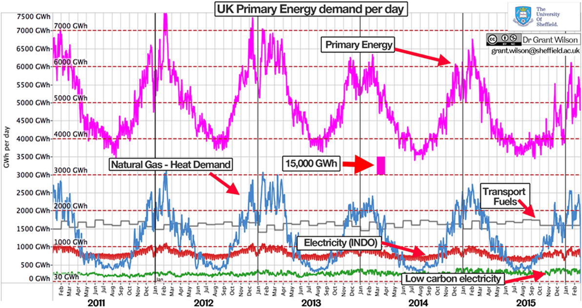
Figure 5. SAED with primary energy demand and low-carbon electricity added for scale.
Imports and Exports
If exports of a primary or secondary energy source are shown on the diagram, they could be shown below the horizontal axis to indicate the exporting nature of the demand. However, as demands are also shown above the horizontal axis, this is another esthetic matter of choice in the creation of a SAED.
How Many Variables?
A slideshow presentation allows the flexibility to present a slidepack of SAEDs with different variables. If these are located in the same place on each slide this simulates the adding (or removal) or different variables between consecutive slides. In this way, a more complex story can be told than with a static diagram. Figure 5 shows a number of interesting additional variables (low-carbon electricity supply and primary energy) that are simple and clear to show during a presentation, however, a static diagram risks becoming too complex, and losing the impact that it may have had with fewer variables. The choice is sometimes difficult, as it not only depends on the reason why a diagram has been created, but the space available to display it and the intended audience too.
How Precise Does the Diagram Need To Be?
It is not the intention of a SAED to be a power flow diagram, as the underlying data may themselves not be precise. However, in order to compare the scale and variation of several supplies and demands against each other, the diagram needs to be correct in terms of matching the time-series axis. Given the lack of detailed data on certain demands, inferences are likely to be made from data that are available. This is felt to be entirely suitable, as it flags up areas that would require further detail to be more robust, but at the same time allows some insights to be gained with existing data.
Gaps are an inevitable part of energy systems data sets, and should be dealt with in a common sense manner, e.g., choosing to use the previous values in a data set, or choosing to use a linear fit between two data points.
Conclusion
The hypothesis that energy visualization diagrams commonly used need additional changes to continue to be relevant is brought about by the changing nature of the energy itself that the diagrams seek to show. As energy systems incorporate greater amounts of variable renewable generation from wind and solar sources, the resolution of the time-series data requires to be improved.
The SAED is an important addition to the toolbox of energy visualization for a number of reasons. It is a simple and readily understood visualization to compare various supplies and demands of an energy system, and it helps to promote whole systems thinking to consider demands other than electrical demands. A SAED can help to put a scale on the amount of flexibility required in the energy system over an inter-seasonal basis, which is something that Sankey diagrams are not designed to do. This scale is important to help frame the different infrastructure, balancing (Elliott, 2016), storage (Strbac et al., 2016), and flexibility (Pfenninger and Keirstead, 2015) options for energy systems.
The creation of a SAED clearly depends on access to the underlying data, and, if this is not available in sufficient detail to allow even a daily visualization to be created, this would be indicative of an area that should require attention and discussion with data providers.
Future energy systems are going to become more and more reliant on primary electricity harvested through variable renewable generators powered by the wind and the sun, i.e., weather-dependent renewable generation. As now, future electrical systems will still require the demand and supply to be balanced on a sub-second level. So if an energy system is currently unable to understand its whole system demands on at least a daily level, then this would indicate an area that it should certainly look to resolve.
The creation of a SAED with a daily level of detail, therefore, provides a very simple test to see whether an energy system indeed has this level of detail, or requires a change to its data-collection strategies to allow it to better prepare for future energy system challenges with a greater evidence base.
If SAEDs with a daily level of detail were able to be created for a range of differing local, national, and regional energy systems, then, this would help to embed whole systems thinking in energy system decision-making. The more that people know how to create and understand this diagram the better, from a whole systems analysis point of view. It would also provide a wider understanding of some of the network challenges that appear when primary energy sources move from fossil fuels (with their intrinsic storage of energy) to renewable electricity sources that require additional flexibility options to match supply and demand, especially over seasonal timeframes.
Part of the process of understanding energy systems in a whole systems manner is aided by the presentation of energy data on a SAED. This novel diagram has been utilized more and more in Great Britain to help make this whole systems viewpoint – to allow a better understanding of the scale and seasonality of the different energy vectors and demands in Great Britain. Understanding the recent historical energy demands and supplies also helps to frame a wider appreciation of the energy challenges of a particular system, and the SAED is a useful addition to the typical energy flow (Sankey) diagrams used by policy makers to understand and present energy systems.
If one considers that future energy systems will have to provide enough energy to end users for their final energy demand at the right time, then one can start to understand the benefit of considering an energy system as an energy system, not just as the electrical system or the transport fuels system. Historically the planning of electrical, natural gas, and transport fuel systems has been largely separate as these have themselves been based on separate fuels. In future, the move to provide greater levels of primary energy from variable renewable energy sources means that more primary energy will be in the form of primary electricity. The problem with electricity, however, is that it is an expensive form of energy to store, it is, therefore, usually turned into something else that is cheaper to store (which has an accompanying energy penalty). The sheer scale of inter-seasonal storage becomes clearer with a daily SAED and suggests an ongoing role for fuels of some sort in Great Britain to provide the Terawatt hours required for inter-seasonal storage.
Whole systems thinking is a prerequisite to whole systems planning, which is an important step in the transition to low-carbon energy systems. The SAED is a useful diagram to developing thinking in a whole systems manner and it is hoped will, therefore, become a more common method to display energy data alongside existing energy data visualizations. The insights that these range of diagrams provide will continue to be useful for policy makers, industry, and customers, as energy systems undergo profound changes in order to limit greenhouse gas emissions. The diagrams help policy makers and industry to find a common language to inform legislation.
Author Contributions
The author confirms being the sole contributor of this work and approved it for publication.
Conflict of Interest Statement
The author declares that the research was conducted in the absence of any commercial or financial relationships that could be construed as a potential conflict of interest.
Funding
This work was funded by grant EP/K007947/1 – CO2Chem Grand Challenge Network by EPSRC in the United Kingdom.
References
Anable, J., Brand, C., Tran, M., and Eyre, N. (2012). Modelling transport energy demand: a socio-technical approach. Energy Policy 41, 125–138. doi:10.1016/j.enpol.2010.08.020
Barrett, J., Peters, G., Wiedmann, T., Scott, K., Lenzen, M., Roelich, K., et al. (2013). Consumption-based GHG emission accounting: a UK case study. Clim. Policy 13, 451–470. doi:10.1080/14693062.2013.788858
Bauer, P., Thorpe, A., and Brunet, G. (2015). The quiet revolution of numerical weather prediction. Nature 525, 47–55. doi:10.1038/nature14956
BP. (2016). Available at: https://www.bp.com/content/dam/bp/pdf/energy-economics/statistical-review-2016/bp-statistical-review-of-world-energy-2016-full-report.pdf
Bridge, G., Bouzarovski, S., Bradshaw, M., and Eyre, N. (2013). Geographies of energy transition: space, place and the low-carbon economy. Energy Policy 53, 331–340. doi:10.1016/j.enpol.2012.10.066
Castillo, A., and Gayme, D. F. (2014). Grid-scale energy storage applications in renewable energy integration: a survey. Energy Convers. Manag. 87, 885–894. doi:10.1016/j.enconman.2014.07.063
Cockroft, J., and Kelly, N. (2006). A comparative assessment of future heat and power sources for the UK domestic sector. Energy Convers. Manag. 47, 2349–2360. doi:10.1016/j.enconman.2005.11.021
Deane, J. P., Gallachóir, B. P. Ó, and McKeogh, E. J. (2010). Techno-economic review of existing and new pumped hydro energy storage plant. Renewable Sustainable Energy Rev. 14, 1293–1302. doi:10.1016/j.rser.2009.11.015
DECC. (2016). Deliveries of Petroleum Products for Inland Consumptions (ET 3.13). Available at: https://www.gov.uk/government/statistics/oil-and-oil-products-section-3-energy-trends
DECC. (2014). Energy Flow Diagram. Available at: https://www.gov.uk/government/statistics/energy-flow-chart-2014
Elliott, D. (2016). A balancing act for renewables. Nat. Energy 1, 15003. doi:10.1038/nenergy.2015.3
Friendly, M. (2008). The golden age of statistical graphics on JSTOR. Stat. Sci. 23, 502–535. doi:10.2307/20697655
Götz, M., Lefebvreb, J., Mörsa, F., McDaniel Kocha, A., Grafa, F., Bajohrb, S., et al. (2016). Renewable power-to-gas: a technological and economic review. Renew. Energy 85, 1371–1390. doi:10.1016/j.renene.2015.07.066
Hawkes, A., Staffell, I., Brett, D., and Brandon, N. (2009). Fuel cells for micro-combined heat and power generation. Energy Environ. Sci. 2, 729–744. doi:10.1039/b902222h
Hittinger, E., and Lueken, R. (2015). Is inexpensive natural gas hindering the grid energy storage industry? Energy Policy 87, 140–152. doi:10.1016/j.enpol.2015.08.036
Hittinger, E., Whitacre, J. F., and Apt, J. (2012). What properties of grid energy storage are most valuable? J. Power Sources 206, 436–449. doi:10.1016/j.jpowsour.2011.12.003
IMechE. (2014). Available at: https://www.imeche.org/docs/default-source/reports/imeche-energy-storage-report.pdf
IMechE. (2015). Available at: https://www.imeche.org/docs/default-source/reports/imeche-heat-report.pdf
IRENA. (2016). Renewable Energy Statistics 2016. Abu Dhabi: The International Renewable Energy Agency.
National Grid. (2016a). National Grid Data Item Explorer. Available at: http://www2.nationalgrid.com/data-item-explorer/
National Grid. (2016b). Metered Half Hourly Electricity Demands Data. Available at: http://www2.nationalgrid.com/UK/Industry-information/Electricity-transmission-operational-data/Data-explorer/
Newborough, M., and Augood, P. (1999). Demand-side management opportunities for the UK domestic sector. IEE Proc. Generat. Transm. Distrib. 146, 283–293. doi:10.1049/ip-gtd:19990318
Pfenninger, S., and Keirstead, J. (2015). Renewables, nuclear, or fossil fuels? Scenarios for Great Britain’s power system considering costs, emissions and energy security. Appl. Energy 152, 83–93. doi:10.1016/j.apenergy.2015.04.102
Rubin, E. S., Azevedo, I. M. L., Jaramillo, P., and Yeh, S. (2015). A review of learning rates for electricity supply technologies. Energy Policy 86, 198–218. doi:10.1016/j.enpol.2015.06.011
Sakai, M., and Barrett, J. (2016). Border carbon adjustments: addressing emissions embodied in trade. Energy Policy 92, 102–110. doi:10.1016/j.enpol.2016.01.038
Schiebahn, S., Grube, T., Robinius, M., Tietze, V., Kumar, B., and Stolten, D. (2015). Power to gas: technological overview, systems analysis and economic assessment for a case study in Germany. Int. J. Hydrogen Energy 40, 4285–4294. doi:10.1016/j.ijhydene.2015.01.123
Schmidt, M. (2008). The Sankey diagram in energy and material flow management. J. Ind. Ecol. 12, 82–94. doi:10.1111/j.1530-9290.2008.00015.x
Scottish Government. (2015). Energy in Scotland 2015. Available at: http://www.gov.scot/Resource/0046/00469235.pdf
Scottish Government. (2016). Energy in Scotland 2016. Available at: http://www.gov.scot/Topics/Statistics/Browse/Business/Energy/EIS2016
Slingo, J., Belcher, S., Scaife, A., McCarthy, M., Saulter, A., McBeath, K., et al. (2014). The Recent Storms and Floods in the UK. Available at: http://www.metoffice.gov.uk/media/pdf/1/2/Recent_Storms_Briefing_Final_SLR_20140211.pdf
Spence, I. (2005). No humble pie: the origins and usage of a statistical chart. J. Educ. Behav. Stat. 30, 353–368. doi:10.3102/10769986030004353
Strbac, G., Konstantelos, I., Pollitt, M., and Green, R. (2016). Delivering a Future-Proof Energy Infrastructure. Imperial College London and University of Cambridge Energy Policy Research Group. Available at: https://www.gov.uk/government/uploads/system/uploads/attachment_data/file/507256/Future-proof_energy_infrastructure_Imp_Cam_Feb_2016.pdf
UNFCCC. (2015). Paris Agreement English. 1–32. Available at: http://unfccc.int/resource/docs/2015/cop21/eng/l09r01.pdf
United Nations. (2016). International Recommendations for Energy Statistics, Series M No. 93. Available at: http://unstats.un.org/unsd/energy/ires/
Wilson, I. (2016). Energy-charts dot org – Charting Great Britain’s Energy Transition. Available at: http://www.energy-charts.org
Wilson, I. A. G., McGregor, P. G., and Hall, P. J. (2010). Energy storage in the UK electrical network: estimation of the scale and review of technology options. Energy Policy 38, 4099–4106. doi:10.1016/j.enpol.2010.03.036
Wilson, I. A. G., Rennie, A. J. R., and Hall, P. J. (2014). Great Britain’s energy vectors and transmission level energy storage. Energy Proc. 62, 619–628. doi:10.1016/j.egypro.2014.12.425
Wilson, I. A. G., Renniea, A. J. R., Dingb, Y., Eamesc, P. C., Halla, P. J., and Kelly, N. J. (2013a). Historical daily gas and electrical energy flows through Great Britain’s transmission networks and the decarbonisation of domestic heat. Energy Policy 61, 301–305. doi:10.1016/j.enpol.2013.05.110
Wilson, I. A. G., Rennie, A. J. R., Hall, P. J., and Kelly, N. (2013b). A daily representation of Great Britain’s energy vectors: natural gas, electricity and transport fuels. ISEREE 2013. Available at: http://www.iner.gob.ec/wp-content/uploads/downloads/2015/06/ISEREE_A-daily-representation-of-Great-Britains-energy-vectors.pdf
Keywords: energy system visualization, energy demand comparisons, energy data visualization, seasonal energy demands, whole systems visualization
Citation: Grant Wilson IA (2016) Energy Data Visualization Requires Additional Approaches to Continue to be Relevant in a World with Greater Low-Carbon Generation. Front. Energy Res. 4:33. doi: 10.3389/fenrg.2016.00033
Received: 03 June 2016; Accepted: 18 August 2016;
Published: 31 August 2016
Edited by:
Fu Zhao, Purdue University, USACopyright: © 2016 Grant Wilson. This is an open-access article distributed under the terms of the Creative Commons Attribution License (CC BY). The use, distribution or reproduction in other forums is permitted, provided the original author(s) or licensor are credited and that the original publication in this journal is cited, in accordance with accepted academic practice. No use, distribution or reproduction is permitted which does not comply with these terms.
*Correspondence: I. A. Grant Wilson, grant.wilson@sheffield.ac.uk