
- 1 Department of Mathematics, University of Augsburg, Augsburg, Germany
- 2 Faculty of Statistics, University of Dortmund, Dortmund, Germany
Graphics are widely used in modern applied statistics because they are easy to create, convenient to use, and they can present information effectively. Static plots do not allow interacting with graphics. User interaction, on the other hand, is crucial in exploring data. It gives flexibility and control. One can experiment with the data and the displays. One can investigate the data from different perspectives to produce views that are easily interpretable and informative. In this paper, we try to explain interactive graphics and advocate their use as a practical tool. The benefits and strengths of interactive graphics for data exploration and data quality analyses are illustrated systematically with three complex real datasets.
1 Introduction
Visualization is the process of transforming data, information, and knowledge into visual form making use of humans’ natural visual capabilities. Visualization immediately provides “gestalt” information about the dataset that is useful to quickly understand the dataset. Data visualization is an important part of any statistical analysis, and it serves many different purposes. Visualization is useful for understanding the general structure and patterns in the data, and the association between different variables. According to Cleveland (1993) “Visualization is critical to data analysis. It provides a front line of attack, revealing intricate structure in data that cannot be absorbed in any other way.”
It is important to distinguish between visualizing data and visualizing the results of data analyses. For example, Loftus (1993) shows how figures can be more informative than tabulated hypothesis tests, Gelman et al. (2002) take statisticians to task for not employing graphs to facilitate understanding, and Wainer (2009) shows the different ways uncertainty in data can be effectively communicated using graphical methods. These uses of visualization are important and deserve consideration; however, in this paper we will focus on the use of data visualization techniques to explore the characteristics of data, not to visualize the results of their analyses.
There is a long history of using graphical methods to infer patterns from data, stretching back to the early nineteenth century, using both economic (Wainer and Spence, 2005) and demographic data (Lexis, 1880). In more recent years, the works of Wainer (2009), Chen et al. (2008), Cook and Swayne (2007), Unwin et al. (2006), Young et al. (2006), Wainer and Spence (2005), Wilkinson (2005), Cleveland (1993, 1994), Tufte (1983), and Tukey (1977) have shown how graphical methods can be used in rigorous analyses of many different types of data. Visualizations, however, are often static (e.g., Emerson, 1998), merely utilized for the presentation rather than the exploration of data. Interactive statistical data visualization, on the other hand, is a powerful alternative for the detection of structural patterns and regularities in the data. Static plots do not allow interacting with graphics. User interaction, however, is crucial in exploring data. It gives flexibility and control. One can experiment with the data and the displays. One can investigate the data from different perspectives to produce views that are easily interpretable and informative (Unwin et al., 2006; Theus and Urbanek, 2008). Interactive graphics become indispensable especially when analyzing large and complex datasets, in which case statistical modeling and inference methodologies, generally, fail to account for the complexity of the data satisfactorily (e.g., Unwin et al., 2003).
Visualization is an important complement to analytic statistical approaches and is essential for data exploration and understanding, and as Ripley (2005) says: “Finding ways to visualize datasets can be as important as ways to analyze them.” There are plenty of graphical displays that work well for small datasets and that can be found in the commonly available software packages, but they do not automatically scale up: Dotplots, scatterplots, and parallel coordinate plots all suffer from over-plotting with large datasets (Unwin et al., 2006). As will be shown, interactive graphics are very useful in analyzing data and can provide new insights that would not have been possible using static graphics or statistical methods. Their applications include using interactive visualization techniques to spot mistakes in the data, to find hidden patterns in the data, to find complex relationships among variables. It should be noted, however, that because different datasets have different variables and different relationships among their variables, there is no standard means of visualizing data. That is, sometimes the best visualization method is a scatterplot, sometimes a histogram, sometimes a mosaic plot, or sometimes a trellis plot. There is not a cookbook that provides a specific recipe for a specific type of data – different techniques need to be tried on a specific dataset to see which technique makes the most sense, allowing the dataset to tell its story.
In this paper, we describe a number of real data examples giving persuasive evidence of how interactive graphics lead to insights that could not be obtained with static graphics or analytic statistical methods. We will show how interactive features help out over-plotting problems, and when used in high dimensional plots reveal complex relationships between variables. All plots in this paper are made using the software Mondrian (Theus, 2002).1 Mondrian is highly interactive and offers a wide range of query and data exploration options. All plots can handle large datasets and are fully linked. Mondrian is a free software and can be downloaded from its web site at http://www.rosuda.org/Mondrian/. However, one can also use the package iplots in the R programming language and environment (R Development Core Team, 2010) for interactive graphics. It is difficult to convey the idea of interactivity on a static medium such as paper. All figures in this paper are direct screenshots from interactively using the software package Mondrian.
It is worth the time and effort to learn about interactive graphics. Every dataset is different and hence their analysis is different. In order to explain how to effectively use interactive graphics for exploratory data analysis, we consider three example datasets from different domains, the air flight delay dataset, which is a dataset that contains information on airline flights (Section 3), remote sensed dataset, which contains radiometric information of western region of Australia (Section 4) and the PCI-2 AE dataset, which contains scientific experimental data (Section 5).2
2 Interactivity
The word interaction has been used in a variety of ways in computing over the years. Both Unwin (1999) and Theus (1996) have proposed possible structures for interactive graphics. Integrating the two suggests that there are four broad components of interaction for statistical graphics:
• Querying
• Selection and linking
• Selection sequences
• Varying plot characteristics
Querying is a natural first activity to find out more about the display that you have in front of you. Next, you select cases of interest and link to other displays to gain further information. At this stage, it is helpful to vary the form and format of displays to put the information provided in the best possible light.
2.1 Querying
Querying enables us to find out detailed information about features that grab your attention. What is the value of that outlier? How many missing values are there? How big is the difference in size between two groups? The ability to browse displays quickly and without fuss is very useful for checking first impressions. Providing different levels of querying is an elegant way of aiding the analyst in an unobtrusive manner. For instance, a standard query of a pixel in a scatterplot reports how many points are displayed there (if any), how many of them are highlighted and what range of X and Y values they represent. An extended query provides information on the values of other variables for those points.
2.2 Selection and Linking
Selection is used for identifying a group of cases of interest, using linking to provide more information about them in other displays, commonly using highlighting of some kind. Highlighting means that linked cases are displayed differently from others. Typical applications would be to investigate the properties of a cluster of points in a scatterplot or to look at the patterns of values for a subset of the data.
A more sophisticated form of selection is to use brushing: while the selection tool is moved across the data in a display, the selection is updated in real time. This is an interesting option for exploring conditional structures.
2.3 Selection Sequences
Selections involving several variables can be made with selection sequences (Theus et al., 1998). The idea is to combine the intuitive approach of interactive selection with the flexible power of editable code. All selections are made by clicking or grabbing the relevant parts of graphic displays, using the appropriate selection modes chosen from a tools palette or pop-up menu. The individual components of the sequence are automatically stored, so that they can be graphically altered or amended without affecting the rest of the sequence.
2.4 Varying Plot Characteristics
There are rarely single “optimal” displays in data analysis. Information is gained from working through a range of potential displays: rescaling, resizing, zooming, reordering, reshading, and reformatting them in many different ways. Point sizes may be made bigger in scatterplots to draw attention to outliers. The aspect ratio of a plot may be varied to emphasize or to downplay a slope. The choice of aspect ratio affects how mosaic plots look, and different ratios may be appropriate for different comparisons within a plot. Bar charts may be switched to spineplots to compare highlighted proportions better (Hummel, 1996). A scatterplot axis may be rescaled to exclude outliers and expand the scale for the bulk of the data. The variables in a mosaic plot may be reordered to change the conditional structure displayed. α-blending may be applied to a parallel coordinates display to downplay the non-selected cases. The bin width of a histogram may be varied to provide a more detailed view of the data. A set of plots may be put on a common scale to enable better comparisons.
In next sections, we will explain all these above mentioned features using real data from different domains.
3 Air Flight Delay Dataset
Have you ever been stuck in an airport because your flight was delayed or canceled and wondered if you could have predicted it, if you’d had more data? The US Bureau of Transportation Statistics makes information about all commercial flights in the USA. Analyzing these data offers the potential to understand and predict delays.
The data consists of flight arrival and departure details for all commercial flights within the USA, from October 1987 to April 2008. This is a large dataset; there are nearly 120 million records in total, and takes up 1.6 gigabytes of space compressed and 12 gigabytes when uncompressed. We have taken a sample of one million from 2008.
The format of date/time type variables in which they are recorded and stored is very critical and highly influential on analysis and can give wrong analysis results if they are not properly handled. The arrival and departure times in the air flight delay dataset are stored as character in “hhmm” local time format. Because of this format a regular pattern is visible in Figure 1 (left), which is misleading and fake. This artifact can be overcome by converting the arrival and departure times into numeric format. This fake regular square pattern disappears in Figure 1 (right) when these times are converted into numeric type.
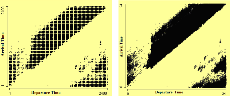
Figure 1. Scatterplots of arrival time by departure time. The departure and arrival times in “hhmm” format in scatterplot on the left show consistent gaps in the data which make a regular square pattern. The scatterplot on the right is drawn after converting times into numeric format, which removes the fake pattern that is visible in the left plot.
In the right-hand scatterplot of Figure 1, it looks like flights in the lower right cluster are those which arrived before they departed. But this is not true; actually these are flights which arrived next day. So a conversion of arrival time into a 48-h span is required. Hence a new arrival time is derived by adding actual elapsed time to departure time. This new derived arrival time is the arrival time of the flight according to the local time zone of the departure airport. This helps somewhat in solving this problem, as shown in Figure 2. In Figure 2, the lower gap in the strip may be due to many airports being closed at night. Analysts should bear in mind that at night there are fewer flights.
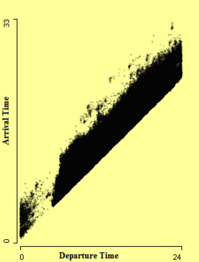
Figure 2. Scatterplot of arrival time by departure time after converting arrival time into a 48-h scale. The gap in the strip may be due to many airports closed at night.
We are aware that there are extreme values for both the distance and airtime. It may therefore be instructive to ask whether the distance and airtime data are internally consistent – that is, to ask if the airtimes are plausible in the context of the distances traversed and vice versa. One way to pursue this question is to construct a scatterplot of airtimes by distances. One such scatterplot of airtime by distance covered by aircraft is shown in Figure 3. The internally inconsistent values are clearly visible in this plot. Some unbelievably fast aircraft are visible in the lower corner. One arrow points to two flights from Pittsburgh to Kansas, which are more than 700 miles distant from one other. These flights took only 2 min airtime from Pittsburgh to Kansas, which is unbelievable. Also very slow flights are visible. A second arrow points to two flights from Atlanta to Louisville and these airports are at a distance of around 321 miles. The airtime of these flights is 304 min, which is quite high for a multi-engine aircraft.
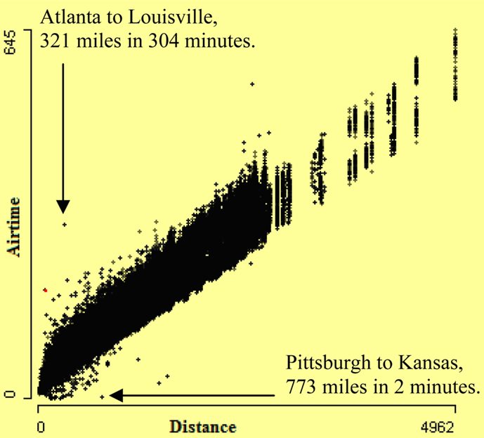
Figure 3. Scatterplot of airtime by distance. It shows some very fast and some very slow flights.
Trellis plots is another way of visualizing multiple variables data, introduced by Becker et al. (1996). Trellis displays use a lattice like arrangement to place plots onto panels. The flights in the dataset involve different types of aircraft. There are big aircraft with multiple jet engines like Boeing 747’s and also small propeller-driven aircraft. So comparing the speed and distance of aircraft with the same engine type may reveal more errors. Scatterplots of airtime by distance conditioned by engine type of aircraft should expose flights with inconsistent airtime and distance.
The conditional framework in a trellis display can be regarded as static snapshots of interactive statistical graphics. The single view in a panel of a trellis display can also be thought of as the highlighted part of the graphics of the panel plot for the conditioned subgroup (Chen et al., 2008). In Figure 4, a scatterplot of airtime by distance is shown. The highlighting is done using the variable aircraft type. The aircraft type “balloon” is highlighted. The highlighted cases in this scatterplot show that many balloons fly with the speed of a jet plane. The arrow points out flights that took 3 h to travel 1500 miles, which is quite fast for a balloon. The airtime and distance are consistent with each other but they are not consistent with aircraft type. Therefore aircraft type is dubious.
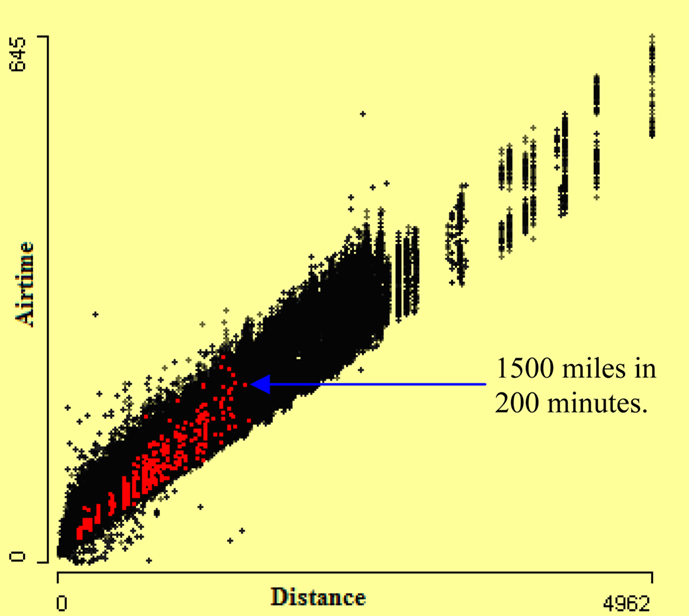
Figure 4. Scatterplot of airtime by distance. Cases with aircraft type “balloon” are highlighted. Many of them are as fast as a jet plane.
The underlying relationship between distance and airtime provides another approach to checking the internal consistency of the data. We can compute an average speed for each flight (distance divided by airtime) and inspect for outliers. We might wonder about the consistency of speed of different flights, and the average speeds can give us a glimpse into the development of that consistency. Doing so reveals many unusual observations. A boxplot (cf. McGill et al., 1978; Benjamini, 1988) of average flight speed will reveal outliers. Flights with implausibly high average speed will be visible in a boxplot. Also, average speed is dependable on engine type. The boxplots in Figure 5 (top) show that average speed also varies by engine type of aircraft significantly. The boxplots also clearly display outliers, and are particularly useful with a large dataset. Interactive features like zooming and querying identify dubious data more easily and precisely. In Figure 5 (bottom), boxplots are zoomed in, which shows very slow speed flights. From this plot, we can see that median speed of aircraft “Turbo-Prop” varies significantly from that of other aircraft engine types. By zooming, we can see lower outliers easily. It is also noticeable that there is no outlier value for aircraft whose engine type is “None” reported.
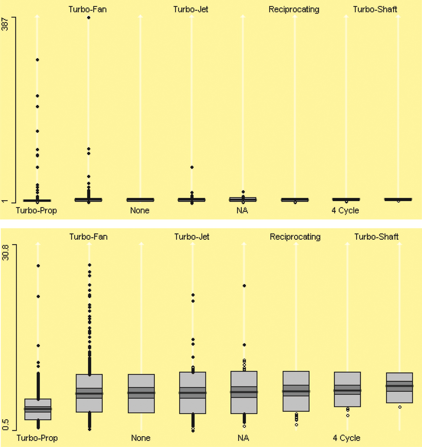
Figure 5. Boxplots of aircraft average speed by engine type on top and after zooming in bottom. The zooming shows aircraft that have very low average speed.
Figure 6 allows us to investigate the relationship between speed and total flight distance more precisely. Not surprisingly, the aircraft speed is not directly associated with the distance covered by the aircraft, as the scatterplot on the left of Figure 6 shows. The outliers are visible in this scatterplot. This plot is somewhat misleading. The zoomed version on the right reveals that shorter flights varied far more, and there seems to be a strong curvilinear pattern in the data. We see that the outliers are mostly for short flights. The distorting effect of the extreme values is demonstrated by the fact that the zoomed plot magnified the y-axis by a factor of about 1/20 and discarded 150 extreme outliers.
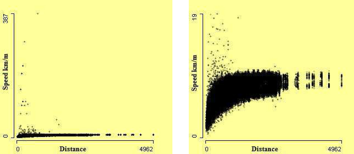
Figure 6. Scatterplots of speed against distance. On the left, all 969,304 cases. On the right, after removing 150 extreme outliers, using zooming.
Usually it is observed that arrival delay is highly associated with departure delay, the more the departure delay, the higher the arrival delay. High association between departure delay and arrival delay is visible in the left-hand scatterplot of arrival delay by departure delay in Figure 7. Bivariate outliers are visible from this scatterplot. Arrow 1 shows the flights that departed much after scheduled departure time but arrived before scheduled arrival time. Arrow 2 shows the flights which have a very high difference between departure delay and arrival delay. Zooming the values close to (0, 0) in the right-hand plot in Figure 7 shows clearly implausible values. For example, the arrow in the right-hand plot of Figure 7 shows a flight which departed with a delay of 1 min but arrived 91 min earlier than its scheduled arrival time.
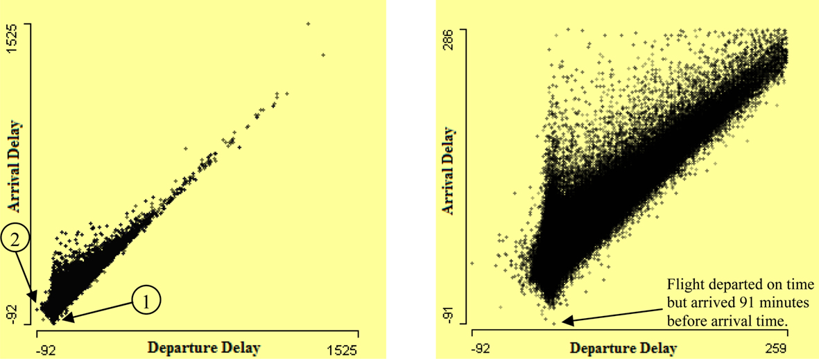
Figure 7. Scatterplot of arrival delay by departure delay on the left. It shows many flights have much more arrival delay than departure delay. A few flights are delayed but arrived earlier than arrival time. The right-hand plot presents a zoom of lower left corner of left plot.
It is also interesting to see the difference between actual elapsed time and scheduled elapsed time of flights. Flights which took far less and far more time than scheduled time can be revealed easily by a scatterplot. Scatterplot of actual elapsed time by scheduled elapsed time is shown in Figure 8. The flights which took less and more elapsed time than their scheduled elapsed time are visible. It is apparent that variation in actual elapsed time for small flights is much higher. Actual elapsed times that are very different from scheduled elapsed times are potentially erroneous cases. The flights which arrived 50 min earlier than scheduled times are highlighted using linked histogram. The arrow in this figure points out the flights that took almost half the scheduled elapsed time, which is implausible.
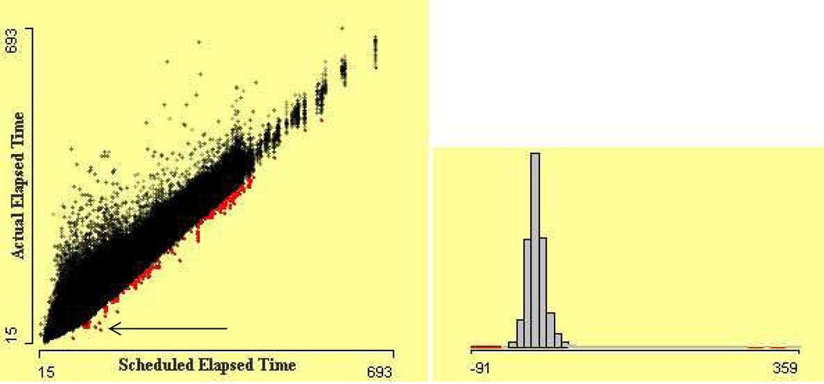
Figure 8. Scatterplot of actual elapsed time by scheduled elapsed time. The flights which arrived 50 min earlier than scheduled arrival time are highlighted using linked histogram. The arrow points out the flights that took almost half the scheduled elapsed time.
4 Remote Sensed Dataset
Investigating data quality is an important first step in the statistical analysis of a dataset. The final results of applying sophisticated statistical methods can greatly depend on the quality of data. Robust methods may help but cannot deal with all kind of quality issue. Many scientists use different datasets for checking their methods, but they rarely report how they checked the quality of data or if they did so at all. For example, Bertini et al. (2006), Cui and Yang (2006), and Artero et al. (2004) developed different methods for finding data patterns and used a dataset remote sensed without discussing the quality of the data. In this dataset there are a number of unusual features, e.g., two supposedly continuous variables both have a high proportion of cases with the value 255.
out5d is a remote sensed dataset, collected from a western region of Australia. The dataset is available from http://davis.wpi.edu/xmdv/datasets/out5d.html. (Unfortunately, some basic information on how the data were collected and transformed is not available.) These data were collected on a grid of 128 × 128. There are 16384 records in the dataset. Each record contains radiometric information for each cell of the grid.
We look at the distributions of the individual variables. Figure 9 shows a histogram of the variable SPOT with bin width 1. In Figure 9, the distribution of variable SPOT almost follows a regular pattern. The sudden spikes show heaping of data which might be due to some rounding or transformation of data.
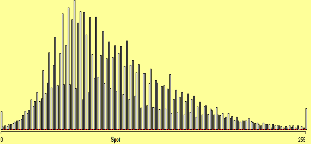
Figure 9. Histogram of variable SPOT with bin width 1. The horizontal red lines on the axis mark bins where the count is zero.
The bivariate distributions also reveal some interesting features. In Figure 10, strong negative association between potassium and magnetics is visible. Outliers are also identifiable here.
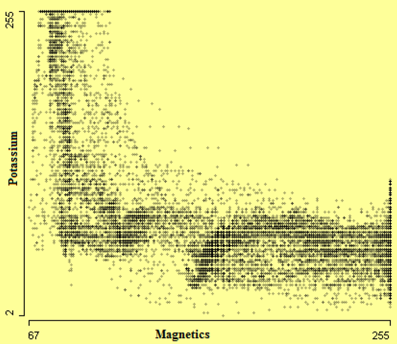
Figure 10. Scatterplot of Potassium by Magnetics.
A parallel coordinate plot (PCP) (Wegman, 1990; Inselberg, 1985, 1998) of all variables in the out5d dataset in Figure 11 shows the structure of relations between variables. α-blending has been used to make the distributional structure more visible. Common scaling has been used as the variables look as if they have been initially standardized. From this we can see additionally that variables SPOT and Mag are negatively correlated. Outliers can be sometimes identified with a parallel coordinate plot. In Figure 11, brushing has been used on the variable SPOT and unusual magnetics and potassium values have been found. Observations which are outliers in more than one variable can be identified in PCP. Brushing the variable Mag led to Figure 12 where a case which is outlying on three variables has been found.
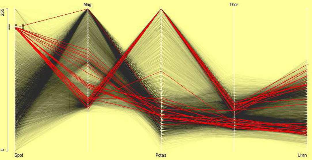
Figure 11. Parallel coordinate plot of all variables in the out5d dataset. Variables are on a common scale. The plot shows that SPOT and magnetics are negatively correlated. A small group is selected in variable SPOT. It shows an outlier in variable Mag.
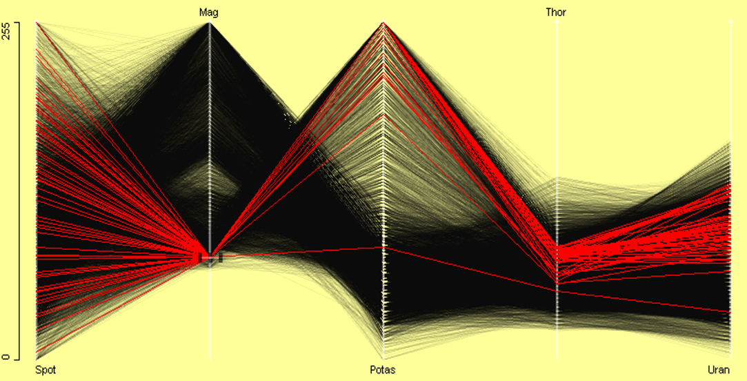
Figure 12. A small group is selected in Mag variable. It shows an outlier with low potassium, thorium, and uranium values.
Although the data are known to have been collected on a rectangular grid, the layout is not known. Assuming that the data are ordered by columns, it is possible to investigate the spatial distribution of the variables. In Figure 13, the locations are selected where value of potassium is 255. From this we can see that the maximum level of potassium lies only in the upper right corner of grid.
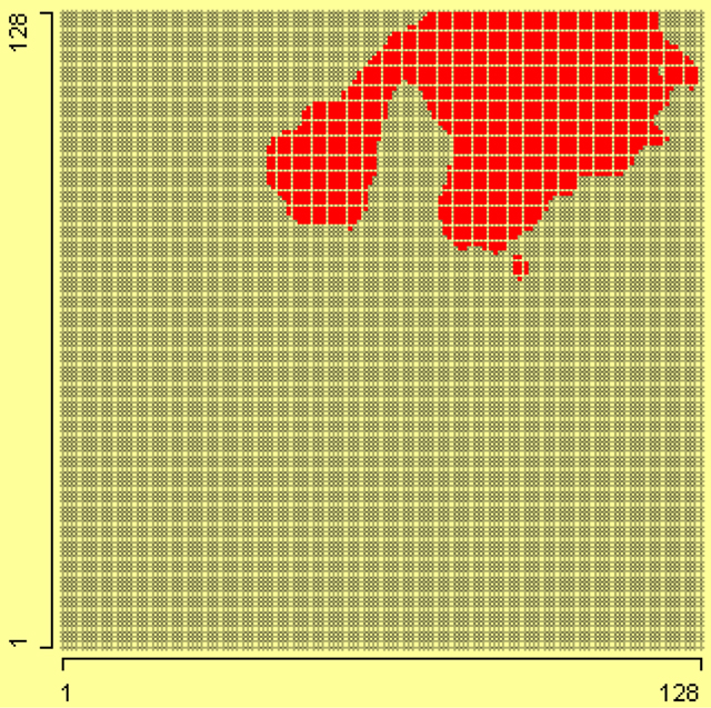
Figure 13. On the grid of 128 × 128, the value 255 of potassium has been selected using a linked histogram.
On the grid in the left plot of Figure 14, the maximum value of magnetics, i.e., 255, is selected. This shows that high value of magnetics lies in lower right corner of grid. On the grid in the right plot of Figure 14, the values of magnetics from 250 to 254 are selected. These two plots show that value 255 of magnetics is enclosed in a border. This shows that some transformation is applied on data, which converted higher values to 255.
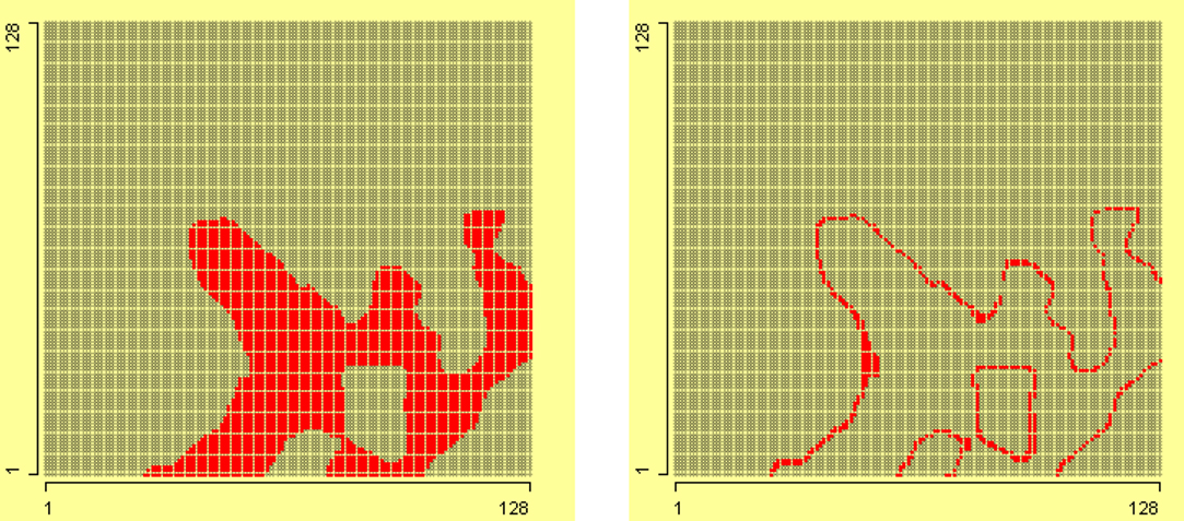
Figure 14. In the left grid of 128 × 128, value of magnetics 255 is selected, and in the right grid, values of magnetics from 250 to 254 are selected.
5 PCI-2 AE Dataset
Acoustic Emission (AE) is defined as a phenomenon where transient elastic waves are generated by the rapid release of energy from localized sources within a material (Kishi et al., 2000). Elastic waves propagate through the solid material and are recorded by one or more sensors. AE analysis is used as a non-destructive evaluation (NDE) technique in a wide range of applications such as locating faults in pressure vessels or leakage in storage tanks and piping systems, corrosion detection, global or local long term monitoring of civil engineering structures such as bridges or offshore platforms. The dataset was provided by the Department of Physics, University of Augsburg. The dataset contains 1136 rows and 33 columns. The rows correspond to an experiment and columns correspond to the variables. No value is missing for any variable.
It is known that signal strength and absolute energy are associated with each other. The signal strength increases as absolute energy increases. The association can be seen in the left scatterplot of SignalStrength by AbsoluteEnergy after logarithmic transformation of data in Figure 16. Circle 1 points cases which can be shown to be outlier group in Figure 15. Circle 2 points to cases, which have surprisingly high signal strength. The linked scatterplot on the right of Figure 16 of Energy by AbsoluteEnergy shows that these instances have normal energy and normal absolute energy. Since all these variables are associated with each other, this suggests that variable SignalStrength is in error for these cases.
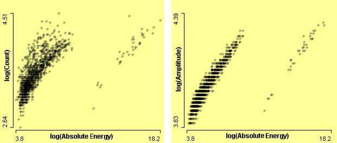
Figure 15. On the left, a scatterplot of Counts by AbsoluteEnergy, and on the right, scatterplot of Amplitude by AbsoluteEnergy, after log transformations.
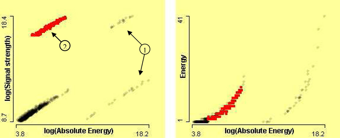
Figure 16. On the left, scatterplot of SignalStrength by AbsoluteEnergy after log transformations, and on the right, scatterplot of Energy by AbsoluteEnergy after log transformation of absolute energy.
The erroneous data points in variable AbsoluteEnergy mask the relation between amplitude and absolute energy. The zooming allows us to zoom-in and see the data in more detail. A series of scatterplots of Amplitude by AbsoluteEnergy is shown in Figure 17 with zoom level of 10−1, 10−2, and 10−4 on the x-axis (from top left to bottom right). The positive association between Amplitude by AbsoluteEnergy is visible after removing the outliers.
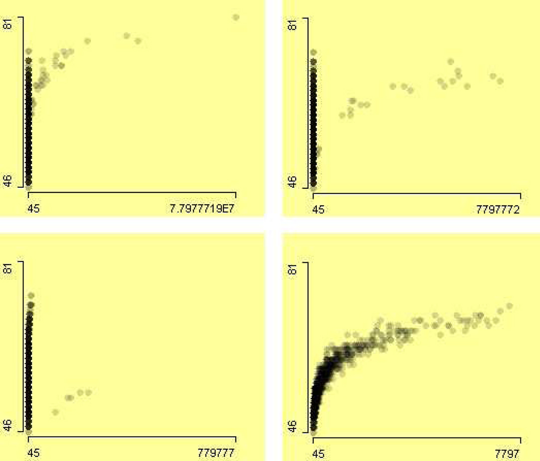
Figure 17. A series of scatterplots of the variable Amplitude by AbsoluteEnergy with different zoom level. The zoom-in starts from top left to bottom right with factor of 10−1, 10−2, and 10−4 on the x-axis.
The left scatterplot in Figure 18 seemingly shows that variables PartialPower1(FX) and PartialPower1 are not associated with each other. However, a clear association is visible in the scatterplot on the right of the Figure 18 after removing the two erroneous cases, using zooming. The partial power is the initial power and partial power (FX) is the power at the first crossing of threshold. Therefore partial power (FX) should be equal or less than partial power, since signal power declines with the time. However in a few cases PartialPower1(FX) is greater than PartialPower1, which is an error. These cases are highlighted using a linked histogram of the difference of these two variables, shown in Figure 18. The zooming allows us to see a clear relationship between these two variables in the scatterplot on the right.
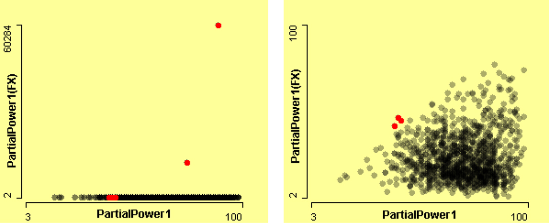
Figure 18. Scatterplots of PartialPower1(FX) by PartialPower1. The left-hand plot presents all of the data. The right-hand plot presents a zoom of almost 10−3 on the y-axis. These cases are highlighted using a linked histogram of the difference of these two variables.
In scatterplots of different variables, it has been observed that variables are associated with each other. If the counts are high then the signal duration must be long, if signals have high absolute energy then amplitude should be high, and so on. A parallel coordinate plot visualizes multivariate continuous variables. High dimensional plots are especially helpful in identifying anomalies. A parallel coordinate plot of seven variables is shown in Figure 19 (top). Signals of duration between 117 and 122 have been selected and the rest of the cases filtered out in Figure 19 (bottom). An outlier case is shown in it. The outlier case in AverageFrequency is also an outlier in Counts. This is obvious since average frequency is derived from counts and duration.
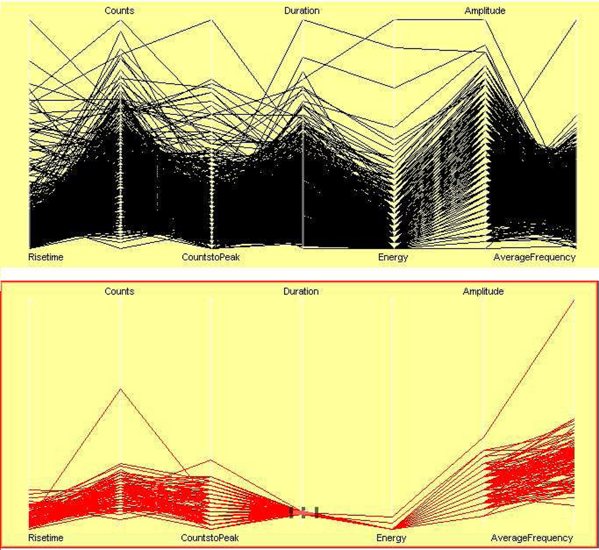
Figure 19. Parallel coordinate plots of seven related variables. Signals of duration between 117 and 122 s are highlighted, and rest of the cases are filtered out.
6 Conclusion
Data exploration is an important part of any data analysis. It is necessary to learn about the data, to check data quality, and then to carry out further analysis. Exploratory analysis using interactive graphics benefits from good domain knowledge. Therefore, in this paper we have used datasets from different domains to illustrate the use of domain knowledge in an interactive graphical system for exploratory data analysis.
At this point it is important to note that interactive graphics and analytic statistical methods are not competing approaches, but rather they are supportive of each other. The information gained from visual data exploration, for instance, can be consulted as a benchmark against which to compare the findings obtained from inferential methods. In particular, graphics are not to be misunderstood as an inferential or confirmatory technique for drawing generalizations. Graphics and generalization methodologies have to be seen as complementary, not competing, approaches.
Every dataset is different, therefore every data analysis is unique. The air flight delay dataset is interesting to analyze because it is very large and contains potentially much information. Therefore, this enables us to see and analyze different types of problems and errors. Interactivity features, such as selection, querying, linking, and zooming, were used extensively in exploratory analysis.
At least three papers (Artero et al., 2004; Bertini et al., 2006; Cui and Yang, 2006) use the out5d dataset for showing that their methods can perform well, without considering that the data may contain potentially anomalous data. They applied clustering and sampling techniques to show how their methods uncover clusters in data. However, exploratory data analysis has shown that there are several problematic features in the data, especially that in two variables about 20% of the data have the same value. Around 22% of the variable Mag and around 19% of the variable Potas have the value 255.
Analyzing scientific data requires good domain knowledge. However visualization is excellent for showing associations between different variables. In the PCI-2 AE dataset, interactive features help us to see the data in more detail, and this enables identification of the anomalies in the data and associations between variables. The dataset is an example of laboratory data which often have several steps between measurement and recording. The value of transforming some of the variables to visualize them effectively is underlined. Several interesting associations between variables were uncovered.
Applying statistical models before exploring data is an inefficient approach. Problems may arise because of peculiarities in the data. Features that may be uncovered by complex modeling may be revealed much more easily just by looking.
Conflict of Interest Statement
The authors declare that the research was conducted in the absence of any commercial or financial relationships that could be construed as a potential conflict of interest.
Acknowledgment
The authors gratefully acknowledge helpful comments by the referees. This research was funded by Higher Education Commission of Pakistan (HEC) and supervised by Prof. Antony Unwin, University of Augsburg, Germany.
Footnotes
- ^This paper is not about “how-to-use” specifics of the Mondrian package. Mondrian’s special features and concepts of how to utilize the interactive visualization tools for an advanced data analysis are well presented in Ünlü and Sargin (2009) and Theus and Urbanek (2008).
- ^In the psychological sciences, however, interactive graphics have been neglected so far, because of the initial lack of proper software tools, and more importantly, due to old habits of sticking to commercial software such as SPSS or standalone packages for specific analytic techniques. For researchers in disciplines like quantitative psychology and psychometrics, recently Programme for International Student Assessment (PISA) data have been analyzed using interactive graphics. Ünlü and Malik (2011) and Ünlü and Sargin (2009) utilized interactive glyph graphics and interactive bar charts and spineplots, respectively, for item analysis applications such as distractor analysis, differential item functioning, and invariant item ordering.
References
Artero, A. O., de Oliveira, M. C. F., and Levkowitz, H. (2004). “Uncovering clusters in crowded parallel coordinates visualizations,” in INFOVIS ’04: Proceedings of the IEEE Symposium on Information Visualization (Washington, DC: IEEE Computer Society), 81–88.
Becker, R. A., Cleveland, W. S., and Shyu, M.-J. (1996). The visual design and control of trellis display. J. Comput. Graph. Stat. 5, 123–155.
Bertini, E., Dell’Aquila, L., and Santucci, G. (2006). “Reducing infovis cluttering through non-uniform sampling, displacement, and user perception,” in Proceedings of SPIE, The International Society for Optical Engineering, San Diego, CA.
Chen, C., Härdle, W., and Unwin, A. (2008). Handbook of Data Visualization. Berlin: Springer-Verlag.
Cook, D., and Swayne, D. (2007). Interactive and Dynamic Graphics for Data Analysis. New York: Springer.
Cui, Q., and Yang, J. (2006). Measuring data abstraction quality in multiresolution visualizations. IEEE Trans. Vis. Comput. Graph. 12, 709–716.
Emerson, J. W. (1998). Mosaic displays in S-Plus: a general implementation and a case study. Stat. Comput. Stat. Graph. Newsl. 9, 17–23.
Gelman, A., Pasarica, C., and Dodhia, R. (2002). Let’s practice what we preach: turning tables into graphs. Am. Stat. 56, 121–130.
Hummel, J. (1996). Linked bar charts: analysing categorical data graphically. Comput. Stat. 11, 23–33.
Kishi, T., Ohtsu, M., and Yuyama, S. (2000). Acoustic Emission – Beyond the Millennium. Oxford: Elsevier Science.
Lexis, W. (1880). La representation graphique de la mortalite au moyen des points mortuaires. Annales Demogr. Int. Tome IV, 297–324.
Loftus, G. R. (1993). A picture is worth a thousand p values: on the irrelevance of hypothesis testing in the microcomputer age. Behav. Res. Methods Instrum. Comput. 25, 250–256.
R Development Core Team. (2010). R: A Language and Environment for Statistical Computing. Vienna: R Foundation for Statistical Computing.
Ripley, B. D. (2005). “How computing has changed statistics,” in Celebrating Statistics: Papers in Honour of Sir David Cox on His 80th Birthday, eds A. Davison, Y. Dodge, and N. Wermuth (Oxford: Oxford University Press), 197–212.
Theus, M. (1996). Theorie und Anwendung interaktiver statistischer Graphik. Augsburger Mathematisch-Naturwissenschaftliche Schriften, Band 14. Augsburg: Wissner.
Theus, M., Hofmann, H., and Wilhelm, A. (1998). “Selection sequences – interactive analysis of massive datasets,” in Proceedings of the 29th Symposium on the Interface: Computing Science and Statistics, Houston, TX. 439–444.
Theus, M., and Urbanek, S. (2008). Interactive Graphics for Data Analysis: Principles and Examples. Chapman and Hall/CRC. London, UK.
Ünlü, A., and Malik, W. A. (2011). Interactive glyph graphics of multivariate data in psychometrics: the software package Gauguin. Methodology (in press).
Ünlü, A., and Sargin, A. (2009). Interactive visualization of assessment data: the software package Mondrian. Appl. Psychol. Meas. 33, 148–156.
Unwin, A. R. (1999). Requirements for interactive graphics software for exploratory data analysis. Comput. Stat. 1, 7–22.
Unwin, A. R., Volinsky, C., and Winkler, S. (2003). Parallel coordinates for exploratory modelling analysis. Comput. Stat. Data Anal. 43, 553–564.
Wainer, H. (2009). Picturing the Uncertain World: How to Understand, Communicate and Control Uncertainty through Graphical Display. Princeton, NJ: Princeton University Press.
Wainer, H., and Spence, I. (2005). The Commercial and Political Atlas and Statistical Breviary by William Playfair, 3rd Edn. New York: Cambridge University Press.
Keywords: interactive graphics, exploratory data analysis, data visualization, data mining, outliers, air flight delay dataset, remote sensed dataset, PCI-2 AE dataset
Citation: Malik WA and Ünlü A (2011) Interactive graphics: exemplified with real data applications. Front. Psychology 2:11. doi: 10.3389/fpsyg.2011.00011
Received: 25 August 2010;
Paper pending published: 14 October 2010;
Accepted: 09 January 2011;
Published online: 09 February 2011.
Edited by:
Jeremy Miles, Research and Development Corporation, USACopyright: © 2011 Malik and Ünlü. This is an open-access article subject to an exclusive license agreement between the authors and Frontiers Media SA, which permits unrestricted use, distribution, and reproduction in any medium, provided the original authors and source are credited.
*Correspondence: Waqas Ahmed Malik, Department of Mathematics, University of Augsburg, Universitätsstrasse 14, D-86135 Augsburg, Germany. e-mail: malik@math.uni-augsburg.de